Credit Invoices
🏢 Recurly
⏱️ ~4 months (2017)
🧑🏻💻 Designer (me), PM, Engineer
Recurly is a B2B2C subscription management platform that handles everything from plans and payments to invoices and customer communications. My first project at Recurly aimed to address a key feature request: creating standalone credit documents to improve clarity for customers and align with accounting best practices.
The Business Problem
Before this project, credits were added as line items on invoices, which caused a lot of confusion both for merchants and customers. This was one of our most requested features, and would touch every aspect of the app.
My goal was to make account credits easier to track and understand for both businesses and their customers.
Research
I interviewed 6 merchants to learn about their credit practices and business needs. Insights included:
Customer service reps handle charges, credits, and refunds 100’s of times per day and found the process tedious
After invoicing a charge, credit, or refund, users add an account note 83% of the time, which take several extra steps
The refund page was had a confusing interface and no preview option
Pain Points
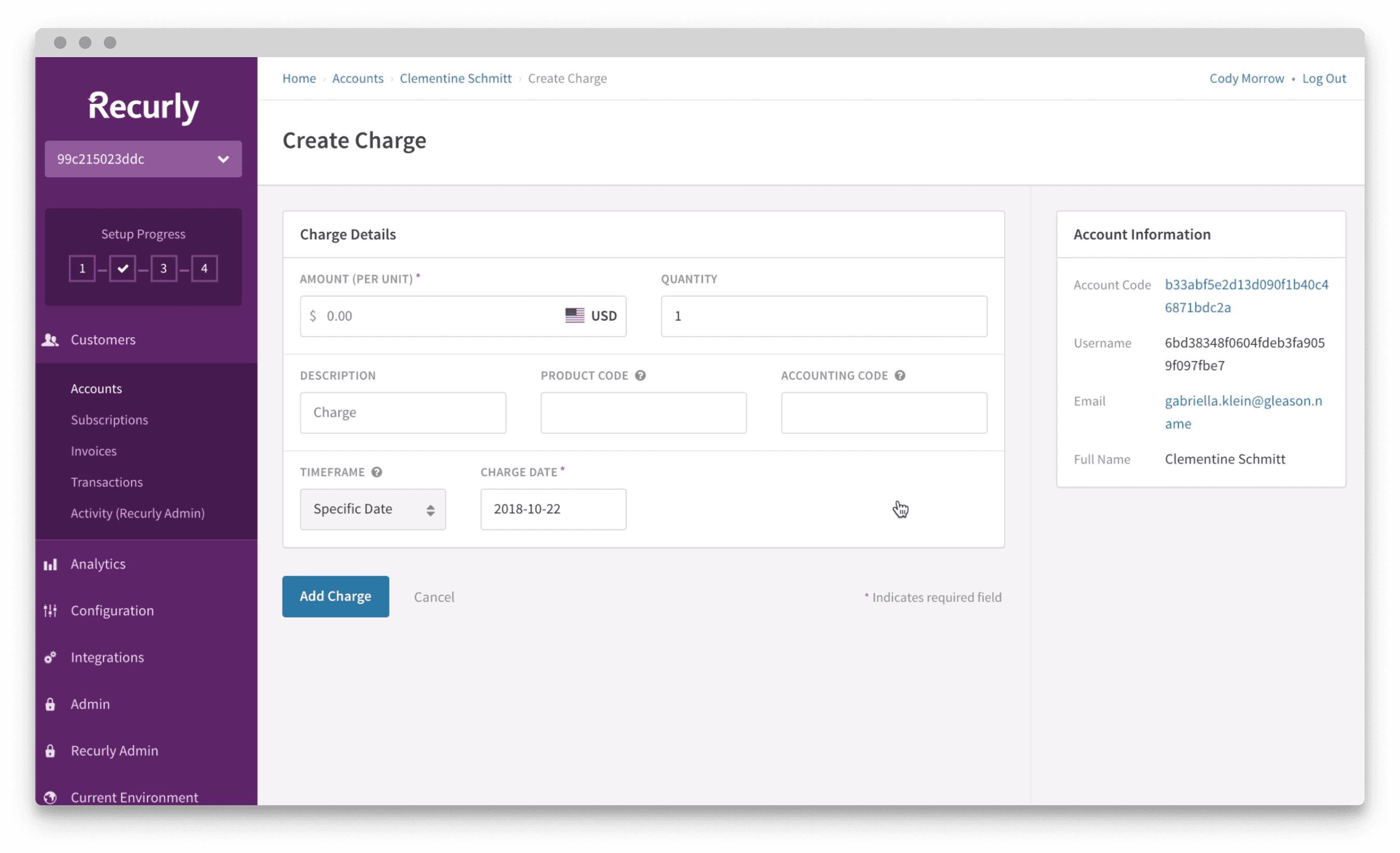
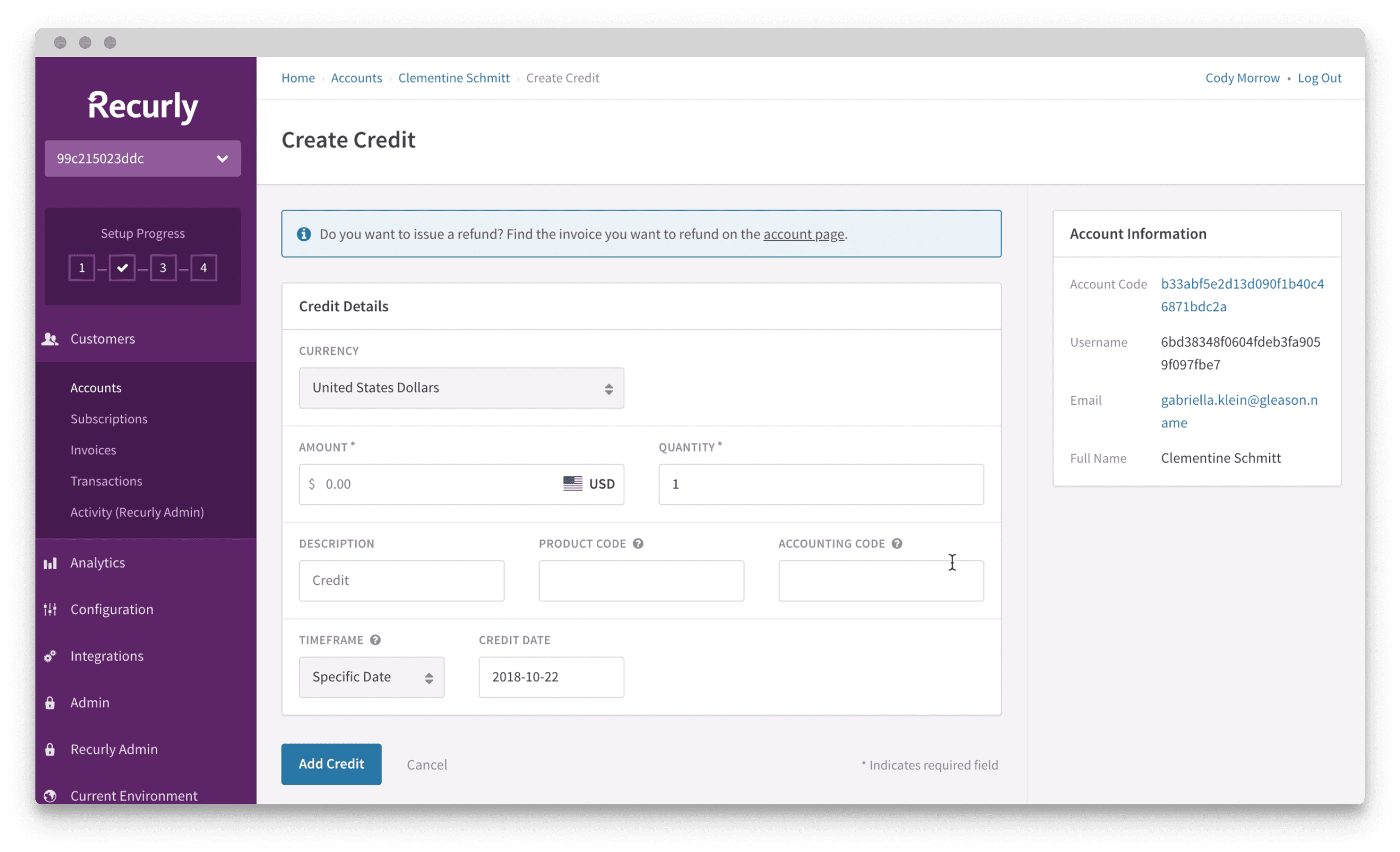
Creating Charges, Credits, and Refunds
There were several UX issues with creating charges and credits, including inconsistent form fields, difficulty tracking credits, and the need to add them one at a time before generating an invoice to capture the updates. The refund page was also problematic, with confusing interactions for switching between line-item and open amount refunds. Additionally, users couldn’t preview refund invoices, leading to frequent customer issues.
The Invoice and Customer Email
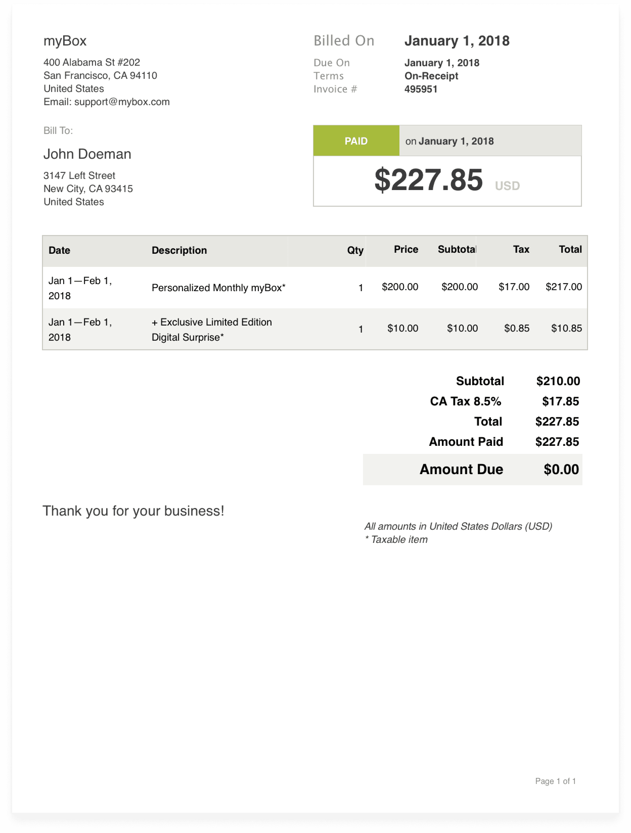
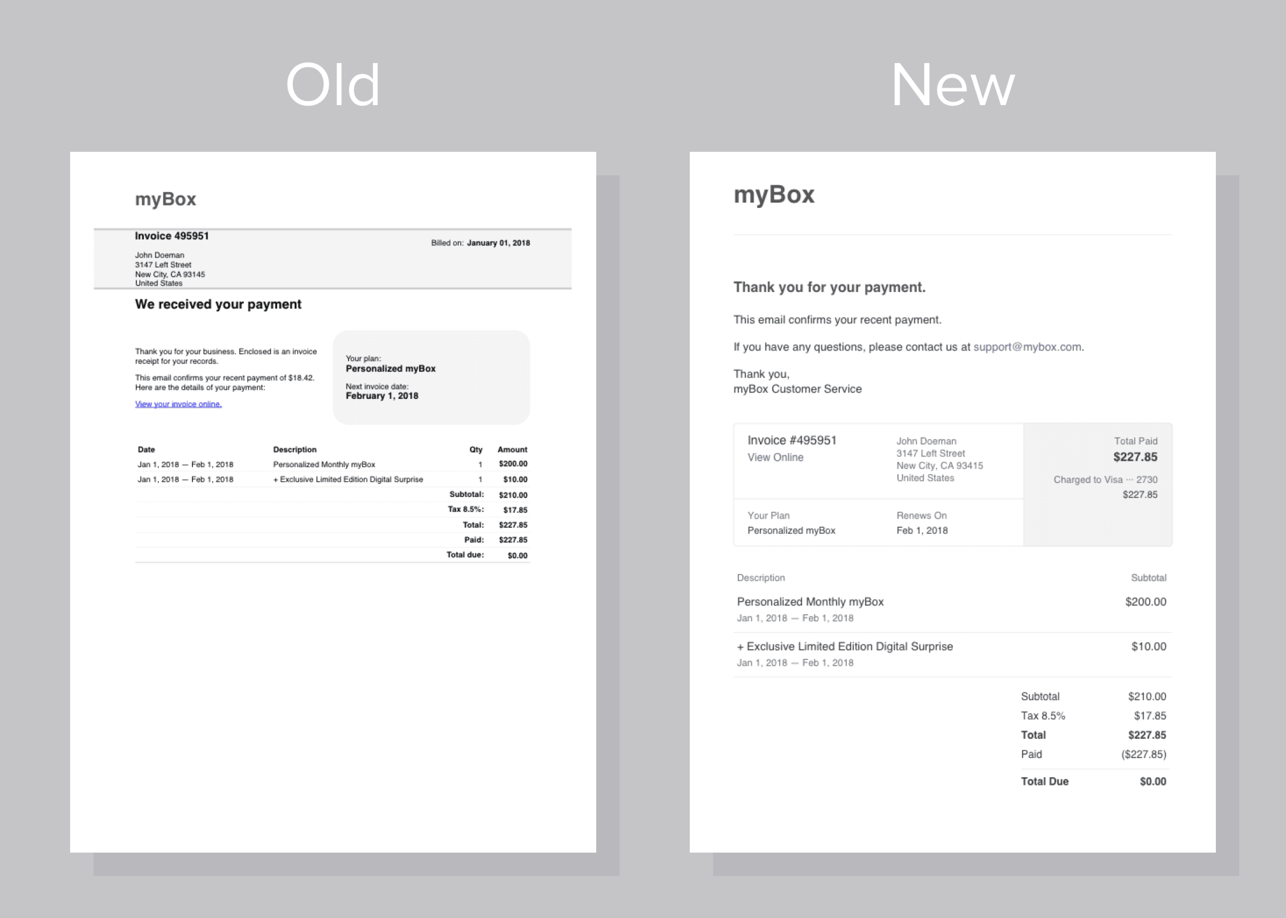
Invoices had to be generated separately after adding charges and credits, making it hard to distinguish between them. The invoice preview was also unhelpful, as users couldn’t edit charges or credits. Additionally, both the invoice and customer emails were visually outdated and overly dense, needing a redesign to improve clarity and readability.
Design Goals
Create a system that supports three types of invoices: charges, credits, and refunds
Improve workflows for adding credits, adding charges, generating an invoice, and adding an account note
Update the designs of emails and invoices to provided clearer information, whil minimizing structural changes due to technical limitations
Design Exploration
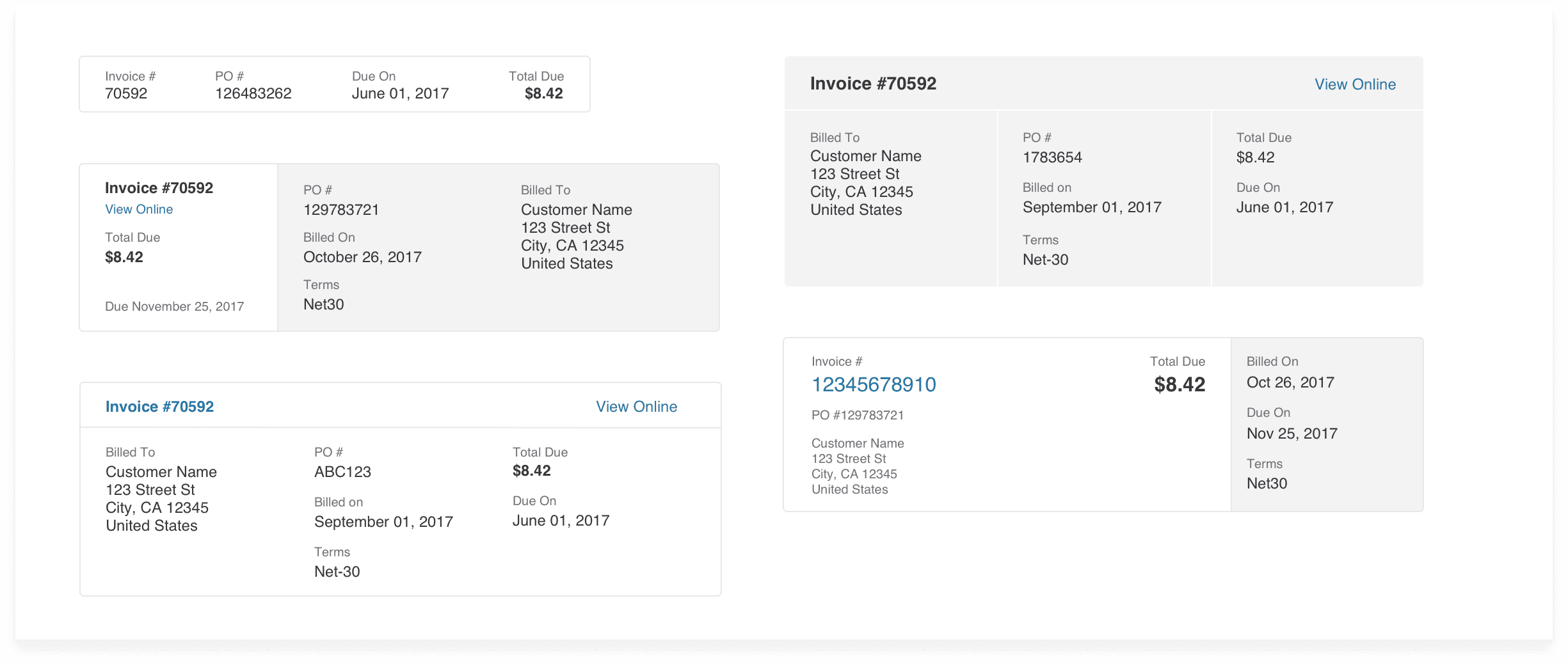
Viewing credit memos as “negative invoices,” I developed a system with distinct document types while maintaining consistency in design. I also explored how to improve the information hierarchy for both invoices and customer emails, covering over 45 use cases across 13 emails.
User Testing
Since this was such a large project, I split the design and testing into 3 phases. This way, development could begin on Phase 1 as I moved to Phase 2 and built upon the system.
The first phase of testing was most critical, as I was testing the new 'add credit' flow, as well as the new invoice system, with the 8 top credit creators.
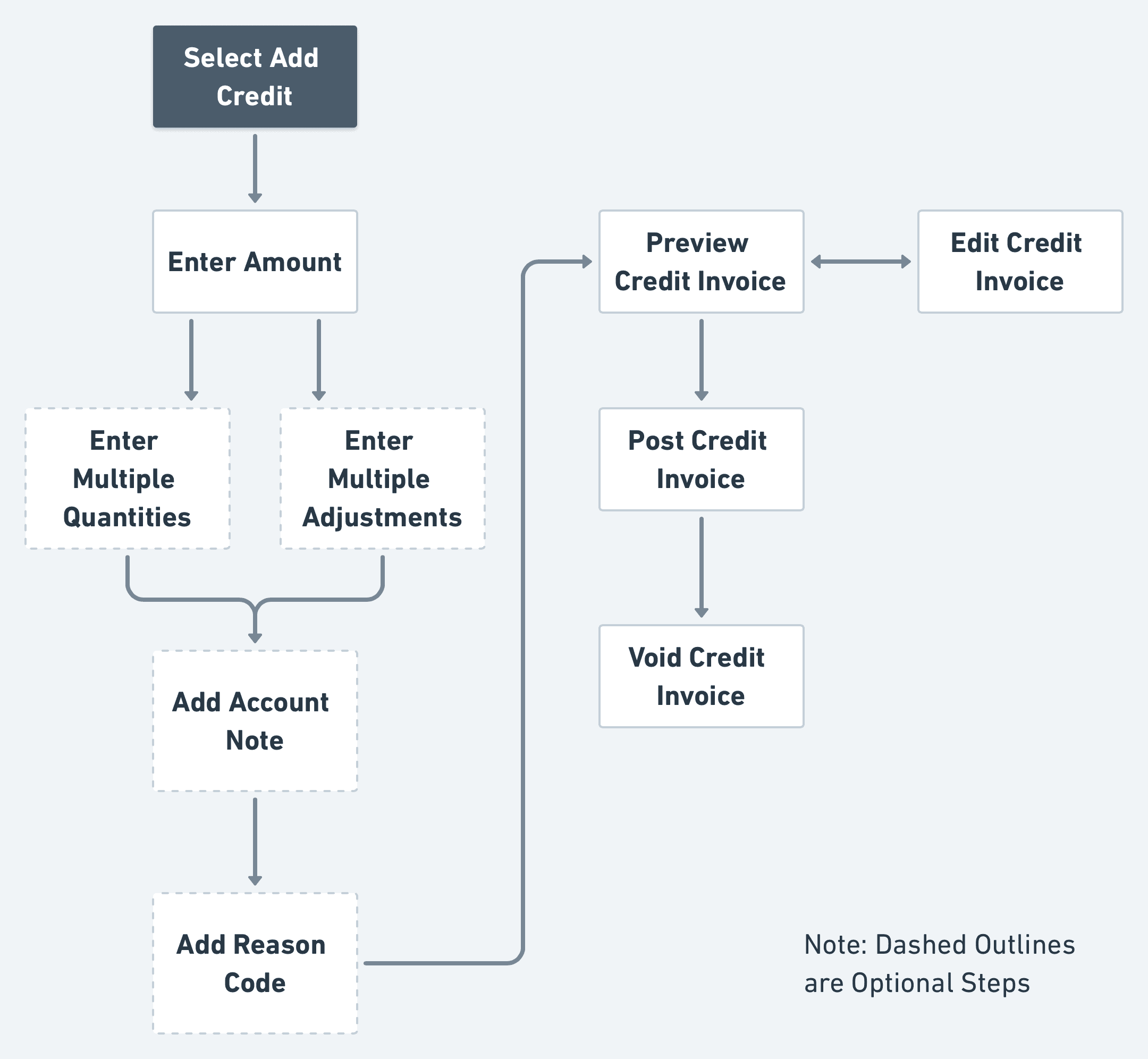
Task 1: Add Multiple Credits to an Account
The first task included a variety of options, allowing for multiple paths and the discovery of new features during the test.
Form options included the ability to add multiple credits at once, a new 'reason code', and options to add an account note and preview the invoice.
Task 1 allowed for several different paths and the discoverability of new fields.
Task 2: Investigate a Subscription Change Scenario
The second task was to investigate a downgrade scenario (a common occurrence for merchants), in which a user switches their plan mid-cycle, resulting in a partial refund for the previous subscription and a prorated charge invoice for the new subscription.
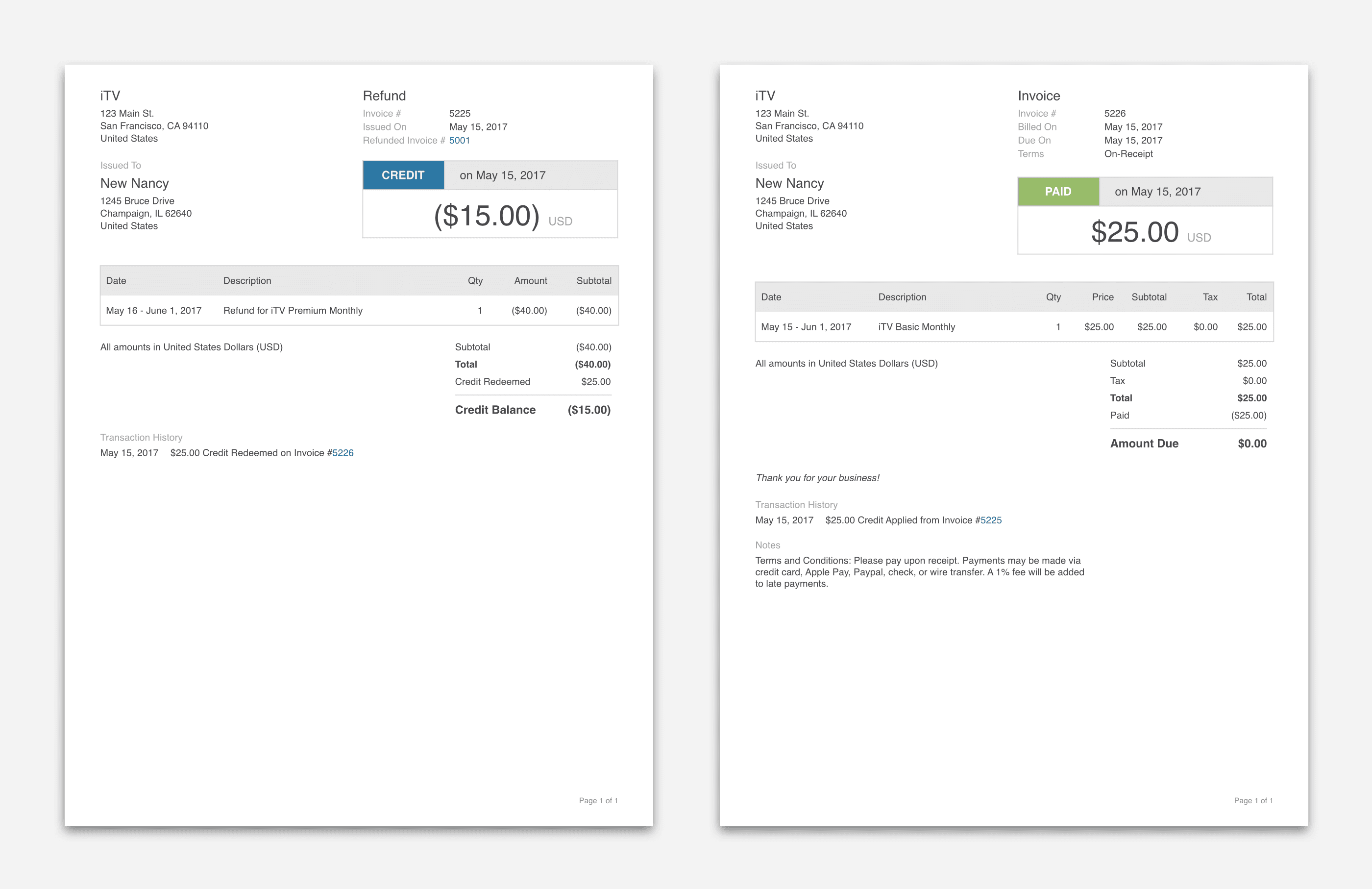
Task 2 had users interact with the new invoice designs, including a new 'transaction history' that provides a record of payments and credit usage.
Test Results
Testing validated the new system and confirmed the separation of invoice types made sense. Feedback highlighted the ease of use and improvements made:
" YAY! You can do credit memos! We previously had to use Quickbooks. "
" The refund invoice tells me the story perfectly. "
" The note makes crediting 180 people for an out of stock item a lot easier! "
The Final Designs
After each round of testing, I incorporated new findings and changes based on feedback and test results. Along with the new invoice system, I combined the steps for adding charges/credits and creating the appropriate invoice.
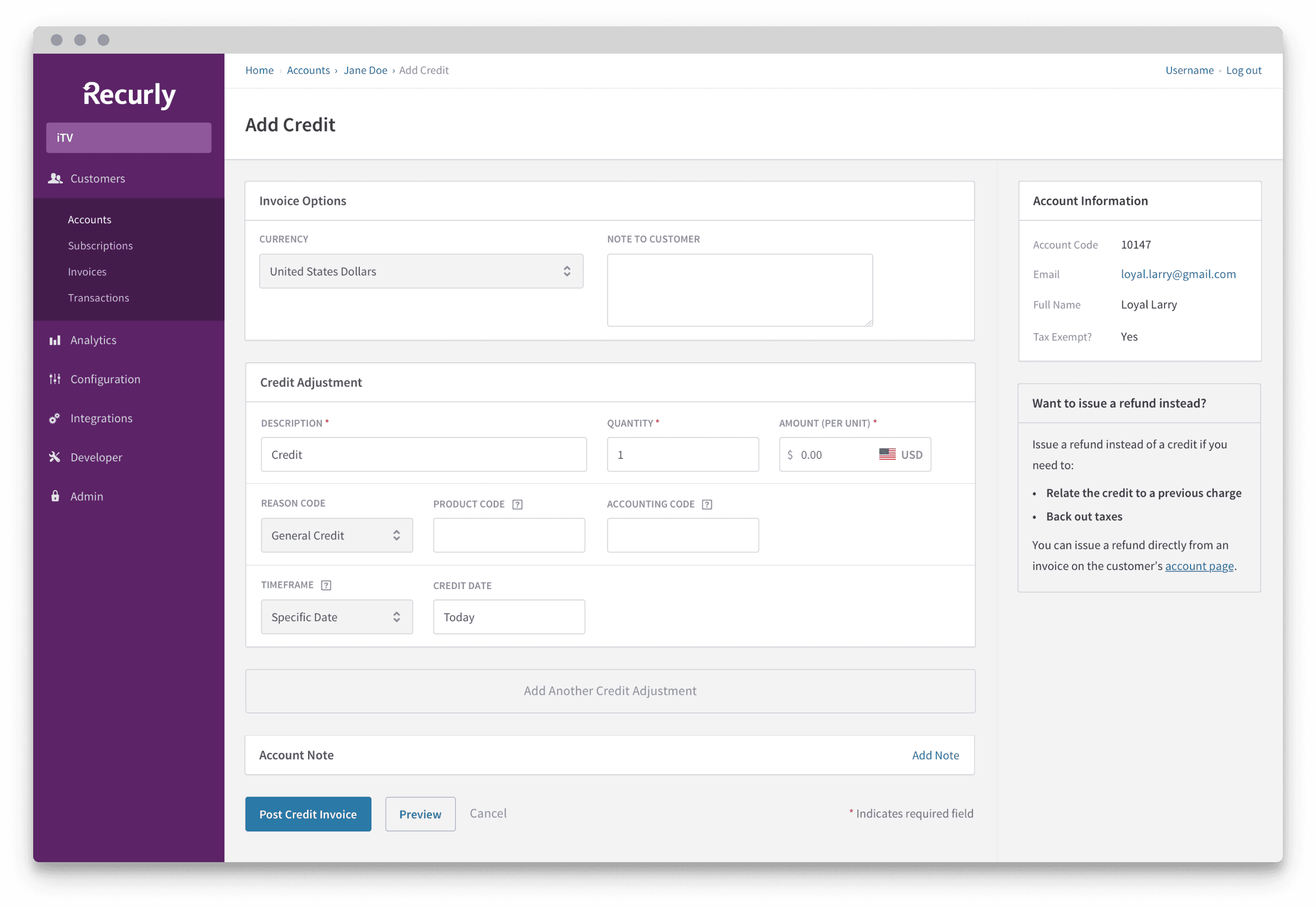
Add Credit
The final flow for adding a credit features the ability to add account notes and multiple credits at once. The form is optimized to more closely resemble the final invoice, and users can preview and edit the invoice before creating.
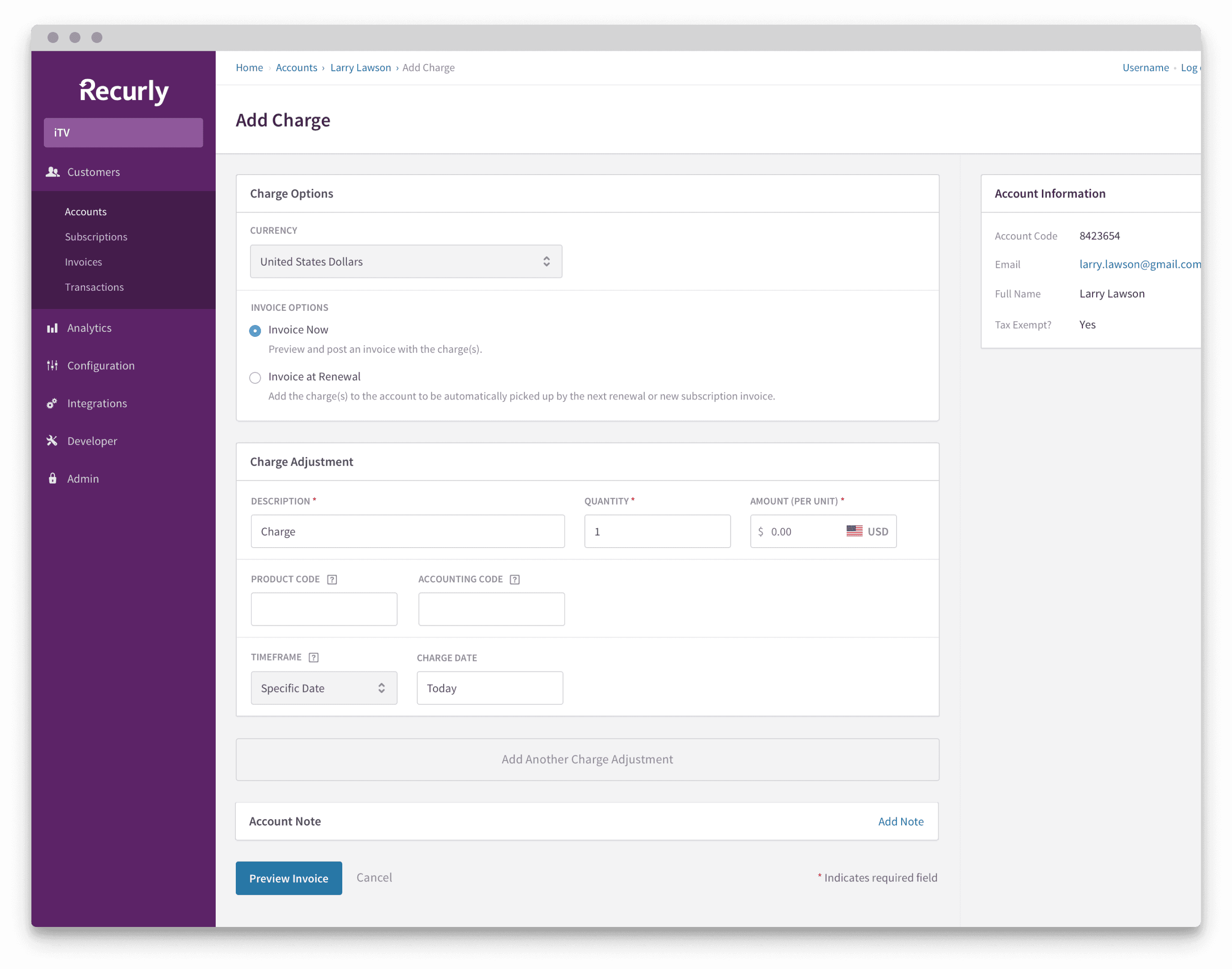
The final charge invoice flow received many of the same improvements as the credit flow, including adding an account note and multiple charges, as well as previewing and editing the invoice.
Issue Refund
The final refund flow was drastically improved, with options clearly presented and incorporating advanced functionality for special use cases of reused credit. Users can also add an account note, and preview and edit the refund, a much requested feature.
Invoices
I updated the visuals of the final invoice, making sure the invoice type at the top clearly stands out. The subtotal section presents information more clearly, and new information is provided in the payments section at the bottom of each invoice.
Customer Emails
I updated the visual style of the email to better align with the invoice, as well as bring focus to the important parts of the email: "Why am I receiving this?" and "How much was I charged?"
Results & Reflections
The results of my work improved the task success rate for associated key tasks in the Recurly app by 21%.
This project was a significant early success in my role at Recurly, and it reinforced the importance of collaborative relationships with PMs, involving users throughout the design process, and the direct impact design can have on a business.

